Start Your Design Today To Shop The Best New Year Deals
Language/Country
Most searched products
Most searched keywords
Morandi Color Palette: The Ultimate "Anti-Failure" Guide for Whole-House Customization
Updated 26/12/25
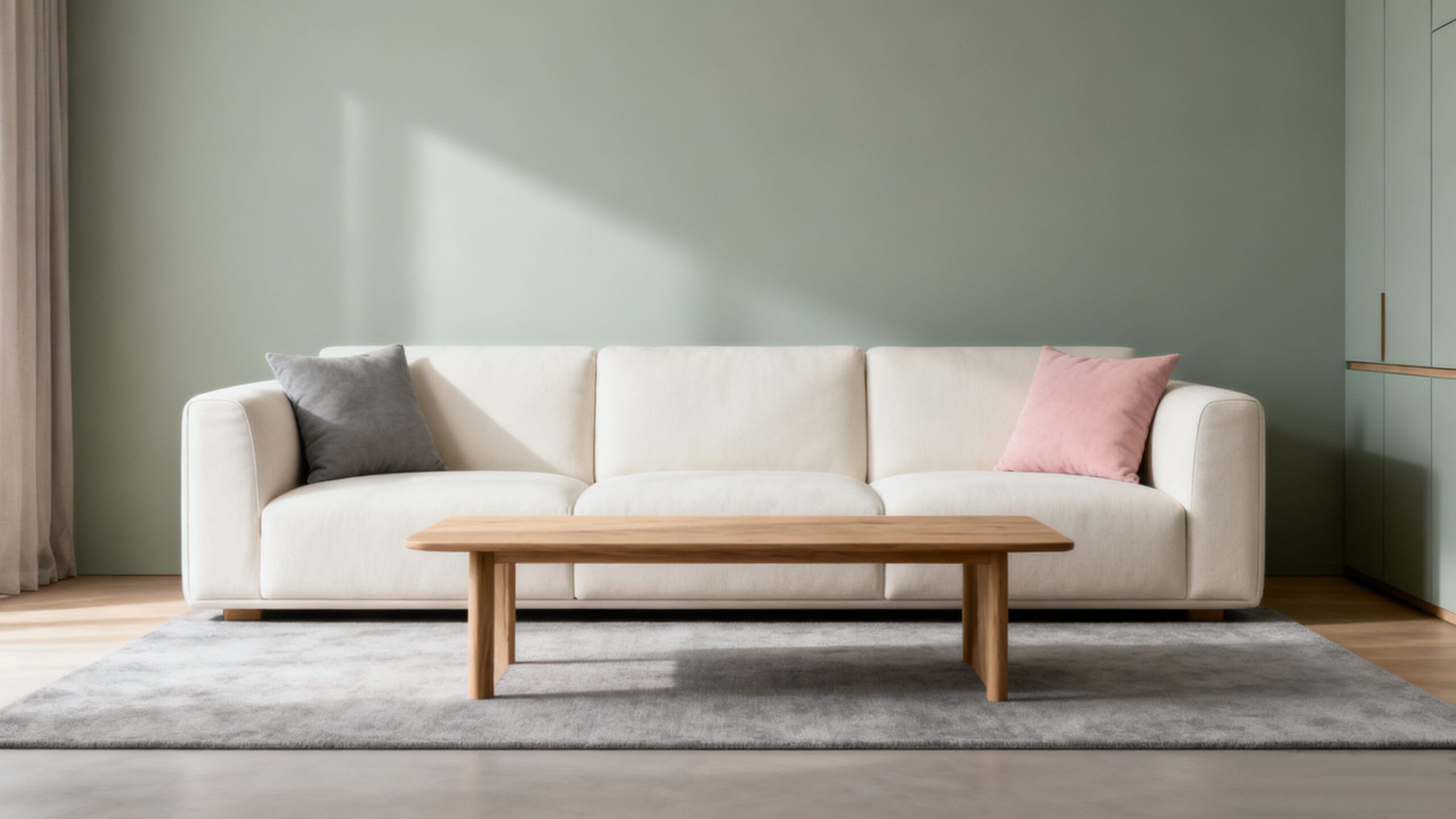
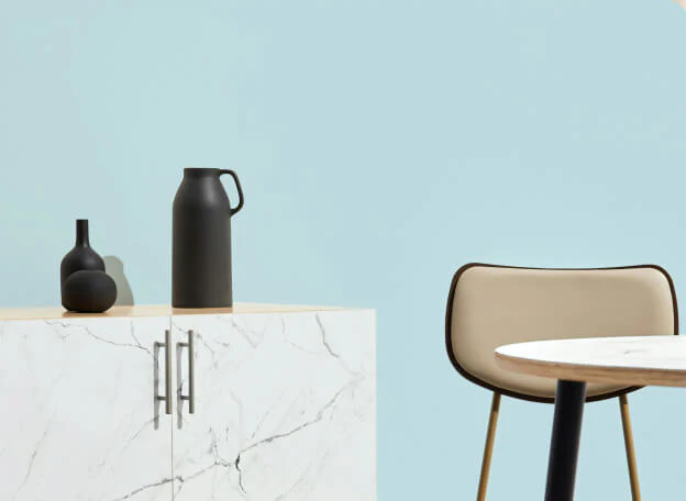
The Morandi color palette, inspired by the Italian painter Giorgio Morandi, has become the gold standard for "quiet luxury" and "sophisticated minimalism" in high-end interior design. Its muted, grey-toned hues provide a sense of tranquility and elegance that few other palettes can match.
However, many homeowners find that while the 3D renderings look stunning, the actual result feels "dull," "dirty," or "dark." This Morandi Color Palette Avoidance Guide will help you navigate the common pitfalls of whole-house customization and ensure a premium finish.
Why Morandi Colors Fail: The "Muddy" Reality

The beauty of Morandi colors lies in their low saturation and high gray scale. In a digital rendering, lighting is perfectly controlled. In real life, factors like natural light, floor reflections, and material textures can make these colors look muddy.
Common Pitfall #1:Ignoring the “Light-to-Dark” Ratio
If you choose a dark Morandi gray for both your cabinets and your walls in a room with limited sunlight, the space will feel oppressive.
Always follow the 60-30-10 Rule. 60% primary color (light Morandi), 30% secondary color (cabinetry), and 10% accent color (hardware or decor).
4 Key Areas to Avoid "Traps" in Customization

Lighting: The Soul of Muted Tones
Morandi colors are "chameleons." They change drastically under different light temperatures ($2700K$ vs $6000K$).
The Fix: Never finalize your cabinet board selection under the bright fluorescent lights of a showroom. Take the samples to your actual home site.
Pro Tip: Use 4000K (Neutral White) lighting to keep the "gray" tones looking clean and crisp.

Texture: Matte vs. Glossy
 Kitchen")
The "White" Trap
Many people pair Morandi gray with "Cool White" ceilings or floor tiles. This creates a harsh contrast that makes the Morandi tones look "yellow" or "dirty."
The Fix: Use Cream White or Warm White ($L$ value around 90-95) to create a seamless transition.
![{"data":{"pictureId":"F532C288-5E3F-4416-975F-17196CE09466","filterId":"","enter_from":"enter_launch","appversion":"13.7.0","effect_type":"tool","capability_extra_v2":{"erase":[{"panel":"eliminatePen"}]},"effect_id":"erase","imageEffectId":"","playId":"","product":"retouch","capability_key":["erase"],"os":"ios","activityName":"","stickerId":"","infoStickerId":""},"source_type":"douyin_beauty_me"}](https://georgefurniturehome.com/wp-content/uploads/elementor/thumbs/Matte-Black-hardware-rgpugnwaomhk1ee2m46dxl82si0fpjrm8xgfwrjpuo.jpg "Matte Black hardware")
Metal Accents: The "Yellow Gold" Disaster
The Fix: Choose Brushed Champagne Gold, Gunmetal Gray, or Matte Black hardware.
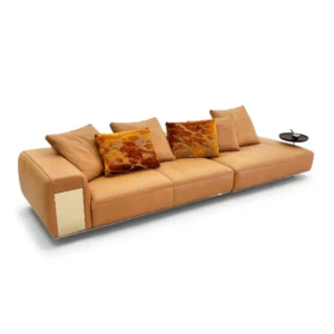
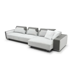
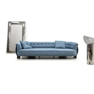
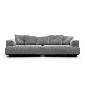
Best-Selling Morandi Color Combinations for 2025

How to Source the Right Boards for Customization?

To us, design has a broader purpose and as you can read about on this website, we are on a mission.
Discover your unique decorating style with our fast, easy, and accurate interior style quiz!
Discover more in our FAQ
What is the E0 standard?
The E0 standard is one of the strictest European and international benchmarks for formaldehyde emissions in composite wood products. It restricts emission levels to $\le$ 0.5 mg/L, ensuring superior indoor air quality. Choosing E0-grade materials is essential for high-end, health-conscious furniture that prioritizes environmental safety.
Can you help me with furniture layout and space planning?
Absolutely! Our expertise in furniture placement and space planning ensures optimized traffic flow, functionality, and visual balance within your space.
Can you help me with selecting paint colors and finishes?
Definitely! Our designers can provide expert guidance on selecting paint colors and finishes that best complement your space, style, and existing elements.
Can you work with existing furniture and decor?
Certainly! We can integrate existing pieces into our design plans, creating a harmonious blend of old and new elements to optimize functionality and visual appeal.
Customer Service.
Mon-Sat, 9am-6pm EST.
Call Us.
+86 18188718632
Get in Touch
Address
24 Block, CASA Ceramic & Sanitary Ware Market, Jihua 4 Road, Chancheng District, Foshan City, Guangdong, China
Your cart
(0)

Order note
Estimate Shipping
Coupon
Product Comparison
| Description |
| Price |
| Vendor |
| Type |
| Product variants |
- Choosing a selection results in a full page refresh.
- Opens in a new window.
Added to cart
Check out our shop to see what's available