ابدأ تصميمك اليوم لتسوق أفضل عروض العام الجديد
المنتجات الأكثر بحثًا

الكلمات المفتاحية الأكثر بحثاً
Morandi Color Palette: The Ultimate "Anti-Failure" Guide for Whole-House Customization
Updated 26/12/25
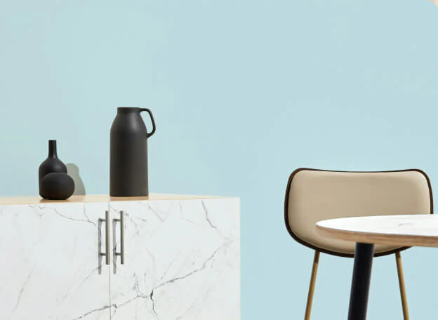
The Morandi color palette, inspired by the Italian painter Giorgio Morandi, has become the gold standard for "quiet luxury" and "sophisticated minimalism" in high-end interior design. Its muted, grey-toned hues provide a sense of tranquility and elegance that few other palettes can match.
However, many homeowners find that while the 3D renderings look stunning, the actual result feels "dull," "dirty," or "dark." This Morandi Color Palette Avoidance Guide will help you navigate the common pitfalls of whole-house customization and ensure a premium finish.
Why Morandi Colors Fail: The "Muddy" Reality

The beauty of Morandi colors lies in their low saturation and high gray scale. In a digital rendering, lighting is perfectly controlled. In real life, factors like natural light, floor reflections, and material textures can make these colors look muddy.
Common Pitfall #1:Ignoring the “Light-to-Dark” Ratio
If you choose a dark Morandi gray for both your cabinets and your walls in a room with limited sunlight, the space will feel oppressive.
Always follow the 60-30-10 Rule. 60% primary color (light Morandi), 30% secondary color (cabinetry), and 10% accent color (hardware or decor).
4 Key Areas to Avoid "Traps" in Customization

Lighting: The Soul of Muted Tones
Morandi colors are "chameleons." They change drastically under different light temperatures ($2700K$ vs $6000K$).
The Fix: Never finalize your cabinet board selection under the bright fluorescent lights of a showroom. Take the samples to your actual home site.
Pro Tip: Use 4000K (Neutral White) lighting to keep the "gray" tones looking clean and crisp.

Texture: Matte vs. Glossy
 Kitchen")
The "White" Trap
Many people pair Morandi gray with "Cool White" ceilings or floor tiles. This creates a harsh contrast that makes the Morandi tones look "yellow" or "dirty."
The Fix: Use Cream White or Warm White ($L$ value around 90-95) to create a seamless transition.
![{"data":{"pictureId":"F532C288-5E3F-4416-975F-17196CE09466","filterId":"","enter_from":"enter_launch","appversion":"13.7.0","effect_type":"tool","capability_extra_v2":{"erase":[{"panel":"eliminatePen"}]},"effect_id":"erase","imageEffectId":"","playId":"","product":"retouch","capability_key":["erase"],"os":"ios","activityName":"","stickerId":"","infoStickerId":""},"source_type":"douyin_beauty_me"}](https://georgefurniturehome.com/wp-content/uploads/elementor/thumbs/Matte-Black-hardware-rgpugnwaomhk1ee2m46dxl82si0fpjrm8xgfwrjpuo.jpg "Matte Black hardware")
Metal Accents: The "Yellow Gold" Disaster
The Fix: Choose Brushed Champagne Gold, Gunmetal Gray, or Matte Black hardware.
تركيبات ألوان موراندي الأكثر مبيعاً لعام 2025

How to Source the Right Boards for Customization?

بالنسبة لنا، التصميم له هدف أوسع، وكما يمكنك أن تقرأ عنه في هذا الموقع، نحن في مهمة.
اكتشف أسلوبك الفريد في الديكور من خلال اختبار التصميم الداخلي السريع والسهل والدقيق الذي نقدمه لك!
اكتشف المزيد في الأسئلة الشائعة
ما هو معيار E0؟
إن معيار E0 هي واحدة من أكثر المعايير الأوروبية والدولية صرامة فيما يتعلق بانبعاثات الفورمالدهايد في المنتجات الخشبية المركبة. وهو يقيد مستويات الانبعاثات إلى $ \le$ 0.5 ملغم/لتر, مما يضمن جودة هواء داخلية فائقة. يعد اختيار مواد من الدرجة E0 أمرًا ضروريًا للأثاث الراقي الذي يراعي الصحة ويضع السلامة البيئية في مقدمة أولوياته.
هل يمكنك مساعدتي في تخطيط الأثاث وتخطيط المساحة؟
بكل تأكيد! تضمن لك خبرتنا في وضع الأثاث وتخطيط المساحات تحسين تدفق حركة المرور والوظائف والتوازن البصري داخل مساحتك.
هل يمكنك مساعدتي في اختيار ألوان الطلاء والتشطيبات؟
بالتأكيد! يمكن للمصممين لدينا تقديم إرشادات الخبراء بشأن اختيار ألوان الطلاء والتشطيبات التي تكمل مساحتك وأسلوبك وعناصرك الحالية على أفضل وجه.
هل يمكنك العمل مع الأثاث والديكور الموجودين؟
بالتأكيد! يمكننا دمج القطع الموجودة في خطط التصميم الخاصة بنا، مما يخلق مزيجاً متناغماً من العناصر القديمة والجديدة لتحسين الأداء الوظيفي والجاذبية البصرية.
خدمة العملاء.
من الإثنين إلى السبت، 9 صباحاً - 6 مساءً بتوقيت شرق الولايات المتحدة.
اتصل بنا.
+86 18188718632
تواصل معنا
العنوان
24 بلوك، سوق CASA للسيراميك والأدوات الصحية, طريق جيهوا 4، منطقة تشانتشنغ, مدينة فوشان، قوانغدونغ، الصين
عربة التسوق الخاصة بك
(0)
مذكرة الطلب
تقدير الشحن
الكوبون
مقارنة المنتجات
| الوصف |
| السعر |
| البائع |
| النوع |
| متغيرات المنتج |
- يؤدي اختيار التحديد إلى تحديث الصفحة بالكامل.
- يفتح في نافذة جديدة.
تمت الإضافة إلى سلة التسوق
تحقق من متجرنا لمعرفة ما هو متوفر لدينا